Interactive SVG Game Boy Component (Vue + Filters + Parallax)
Building an accessible, filter-rich, interactive SVG Game Boy in Vue with glow feedback, CRT mask, animated gradient, button micro-interactions, and tiny parallax.
Bo Cooper
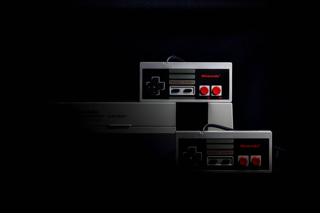
A fun UI flourish: an interactive SVG Game Boy that responds to button presses with a soft phosphor glow and a brief image reveal, while a subtle parallax effect tracks pointer movement. No canvas, no external animation libraries—just plain SVG, a handful of filters, and Vue reactivity.
Why SVG? Filter graph composition (blur, flood, component transfer), precise control over layering, resolution independence, and effortless inline theming.
Goals
- Layered screen: black base, animated gradient wash, optional CRT dot mask, transient image content.
- Fully vector shell with gradient chassis + inset shadows for tactile depth.
- Micro-interactions: button depress (stroke width + translateY) and screen glow feedback.
- Lightweight parallax that doesn't thrash layout.
- Clean separation of interaction logic from presentation (refactor away raw inline DOM event attributes).
Original Component (Truncated)
Below is a condensed view of the raw version (inline onmousedown style mutations, repetitive button markup). We'll improve this shortly.
<template>
  <div class="flex items-center justify-center">
    <div style="width: 400px;" @mousemove="handleMouseMove">
      <svg viewBox="0 0 100 160" preserveAspectRatio="none" class="w-full h-full">
        <defs>
          <linearGradient id="body-gradient" x1="0%" y1="0%" x2="100%" y2="100%">
            <stop offset="0%" stop-color="#e5e7eb" />
            <stop offset="100%" stop-color="#9ca3af" />
          </linearGradient>
          <filter id="inset-shadow" x="-50%" y="-50%" width="200%" height="200%">
            <feComponentTransfer in="SourceAlpha"><feFuncA type="table" tableValues="1 0"/></feComponentTransfer>
            <feGaussianBlur stdDeviation="2" />
            <feOffset dy="2" />
            <feFlood flood-color="black" />
            <feComposite operator="in" />
            <feComposite in2="SourceAlpha" operator="in" />
            <feMerge><feMergeNode in="SourceGraphic"/><feMergeNode/></feMerge>
          </filter>
          <linearGradient id="animated-gradient" x1="0%" y1="0%" x2="100%" y2="100%">
            <stop offset="0%" stop-color="#111" />
            <stop offset="100%" stop-color="#444" />
            <animateTransform attributeName="gradientTransform" type="rotate" from="0 0.5 0.5" to="360 0.5 0.5" dur="10s" repeatCount="indefinite" />
          </linearGradient>
          <pattern id="crt-pattern" patternUnits="userSpaceOnUse" width="2" height="2">
            <circle cx="1" cy="1" r="0.5" fill="#333" opacity="0.5" />
          </pattern>
          <filter id="glow"><feFlood flood-color="pink"/><feComposite operator="in" in2="SourceAlpha"/><feGaussianBlur stdDeviation="3"/><feMerge><feMergeNode/><feMergeNode in="SourceGraphic"/></feMerge></filter>
          <clipPath id="screen-clip"><rect x="12" y="12" width="76" height="56" rx="2" ry="2"/></clipPath>
        </defs>
        <!-- body -->
        <rect x="0" y="0" width="100" height="160" rx="10" fill="url(#body-gradient)" />
        <!-- screen shell -->
        <rect ref="screen" x="10" y="10" width="80" height="60" rx="2" fill="black" filter="url(#inset-shadow)" />
        <!-- dynamic image + overlays omitted for brevity -->
        <!-- buttons, speaker holes ... -->
      </svg>
    </div>
  </div>
</template>
SVG Layer Stack
- Console chassis (rounded rectangle + linear gradient) for subtle diagonal metal/plastic feel.
- Screen bezel (inset shadow filter) to create depth well.
- Image layer (conditionally visible) clipped to screen.
- CRT dot overlay (
pattern) with dynamic opacity. - Animated gradient wash (rotating transform) for ambient energy.
- Glow filter temporarily replaces inset shadow on interaction.
- Input affordances (D-Pad rectangles, circular A/B, pill start/select, speaker grid).
Interaction Mechanics
- Each button click triggers
makeScreenGlow(): shows the image layer, swaps screen filter to glow, sets a timeout to revert. - Mouse movement inside container computes
parallaxX/Ytranslation for the image (just ±0.5px for subtlety). Because transformation happens via inlinestyleit's cheap; no forced layout. - Button press feedback is implemented with inline attribute adjustments (
onmousedown,onmouseup, etc.) mutating style—works but isn't idiomatic Vue.
Refactoring Inline Events
Inline DOM event attributes inside SVG inhibit reuse and testability. We can replace them with Vue bindings plus a utility that toggles “pressed” state.
1. Model Pressed State
const pressed = ref<Set<string>>(new Set())
const press = (id: string) => pressed.value.add(id)
const release = (id: string) => pressed.value.delete(id)
const isPressed = (id: string) => pressed.value.has(id)
2. Dynamic Classes (Tailwind or utility CSS)
:class="['gb-btn', isPressed('dpad-up') && 'gb-btn--down']"
@pointerdown="press('dpad-up')"
@pointerup="release('dpad-up')"
@pointerleave="release('dpad-up')"
@click="handleButton('up')"
3. CSS for State
.gb-btn { stroke: url(#button-stroke); transition: transform 0.1s, filter 0.1s; }
.gb-btn--down { transform: translateY(1px); stroke-width:0.1; }
This removes mutation-of-style strings and centralizes styling.
Glow Feedback Logic
Instead of directly manipulating screenElement.style.filter, use a reactive flag:
const glowing = ref(false)
const makeScreenGlow = () => {
  glowing.value = true
  imageVisible.value = true
  clearTimeout(timeoutId.value)
  timeoutId.value = window.setTimeout(() => {
    glowing.value = false
    imageVisible.value = false
  }, 3000)
}
Then bind:
<rect ... :filter="glowing ? 'url(#glow)' : 'url(#inset-shadow)'" />
Accessibility
- Add
role="img"to the root<svg>witharia-label="Interactive Game Boy demo". - Ensure interactive shapes are keyboard reachable: wrap focusable group inside
<g tabindex="0" @keydown.enter="makeScreenGlow">or swap to<button>overlays absolutely positioned (if strict semantics needed). - Provide reduced motion fallback: skip gradient rotation & parallax if
prefers-reduced-motion: reduce.
const prefersReduced = window.matchMedia('(prefers-reduced-motion: reduce)').matches
if (prefersReduced) {
  // disable rotation via setting a boolean, conditionally render <animateTransform>
}
Performance Notes
| Area | Consideration | Mitigation |
|---|---|---|
| Filters | feGaussianBlur can be expensive | Keep stdDeviation low (<=3) |
| Repaints | Frequent filter swaps | Toggle via attribute not DOM recreation |
| Pointer Move | Many events per frame | Throttle to requestAnimationFrame |
| SVG Size | Large viewport scaling | Fixed viewBox (100x160) + CSS scale |
rAF Throttle Example
let frame = 0
const handleMouseMove = (e: MouseEvent) => {
  if (frame) return
  frame = requestAnimationFrame(() => {
    frame = 0
    // compute parallax ...
  })
}
Speaker Grid Generation
A purely decorative speaker grille uses double v-for to stamp 5x25 circles. For static geometry, consider precomputing the <g> markup or using an inline <symbol> with <use> for repetition.
Encapsulating As a Library Component
Public API (suggested):
image-src(string)glow-duration(ms)parallax(boolean | number)reveal-on-press(boolean)- Slots:
screen(custom content overlay),default(outer wrapper) - Emits:
press(button id),release(button id)
Edge Cases:
- Rapid sequential button presses (timeout reset logic) ✔︎
- Losing pointer outside component mid-press (use
pointerleave) ✔︎ - User disables JS (static SVG still renders) ✔︎
Simplified Improved Version (Excerpt)
<rect
  v-for="b in buttons"
  :key="b.id"
  v-bind="b.attrs"
  :class="['gb-btn', isPressed(b.id) && 'gb-btn--down']"
  @pointerdown="() => { press(b.id); makeScreenGlow() }"
  @pointerup="() => release(b.id)"
  @pointerleave="() => release(b.id)"
  role="button"
  :aria-label="b.label"
  tabindex="0"
  @keydown.enter.prevent="() => { press(b.id); makeScreenGlow(); release(b.id) }"
/>
Testing Checklist
- Buttons: Press visual state toggles (transform + stroke width) ✔︎
- Glow: Appears for configured duration then reverts ✔︎
- Parallax: Moves image subtly; disabled when reduced motion ✔︎
- Keyboard: Enter triggers same path ✔︎
- Memory: Timeouts cleared on unmount ✔︎
Future Enhancements
- Add cartridge slot easter egg: clicking eject triggers alternate image.
- Swap pink glow for dynamic hue based on pressed button sequence (mini Konami code?).
- Export to PNG using
foreignObject+drawImagepipeline. - Add Web Audio API blip sample.
Wrap Up
This component shows how far SVG + native filters can go for playful UI without bundling extra animation or graphics libs. A little refactor removes imperative style mutation, adds accessibility semantics, and keeps interactions smooth.
If you want a packaged version (Nuxt module + tree-shakeable component) or a variant with shader-based screen noise, reach out.
Generative Abstract Shape Gradient Blur Background (Nuxt + Vue Clip-Path)
Build an animated, generative gradient blur background using CSS clip-path polygons with multi-anchor morphing, DX controls, and zero external libs.
Modern Motion in Nuxt with Motion.js
Practical patterns for building fluid, interruptible animations in Nuxt using Motion.js—focus on structure, performance, and accessibility.